Morky 2.0
The Branding Office has been lucky enough to work with Bruce and Denise Morcombe and the team at the Daniel Morcombe Foundation for the last decade, but of all the projects we have helped develop for them, Morky 2.0 was by far our favourite!

The problem: Morky was too big!!! You see the well-travelled Morky, a favourite with kids right around Australia was a touch cumbersome.
The brief: A new streamlined simpler mascot for the child advocacy foundation.
Some background first. Bruce and Denise created the Daniel Morcombe Foundation 15 years ago to honour their then missing son, Daniel. Their tireless work eventually brought a man to justice over Daniel’s murder and all these years later, they still head up the award-winning national child safety advocacy group.
Now you talk about brand importance when dealing with large multinational companies and then talk about brand importance dealing with these two crusaders. Nothing even comes close. This is their heart and soul, it’s Daniel! It’s an honour to be given the opportunity, but we’d be lying if we said it didn’t scare us a little!
So Project “Morky 2.0” was go.
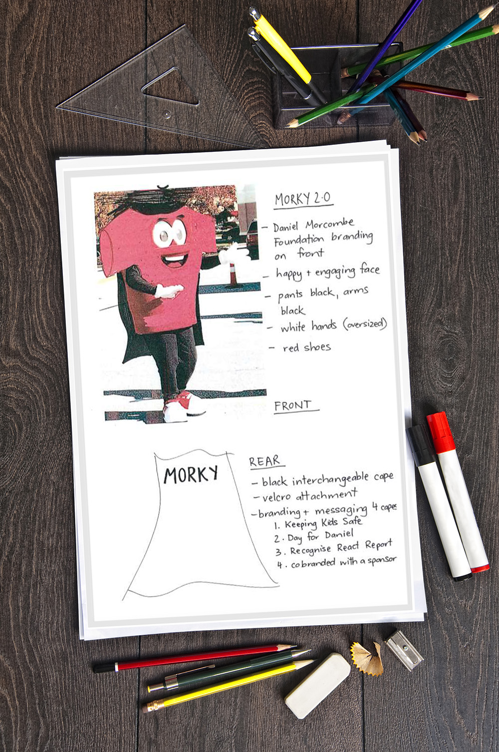
Bruce had a lot of ideas of what he wanted. The idea to add a cape to Morky, gave us that superhero feel, but by allowing the cape to interchangeable also allowed for different messages. Whether it be at a school visit or Day For Daniel or a sponsors event, Morky could easily be customised for each task.
Once the drawing and artwork stage was complete, we started work on a model version to get the dimensions right. The fabric colour was a PMS match and after a few tweaks Morky started to come to life.
We added coloured hand options as well.
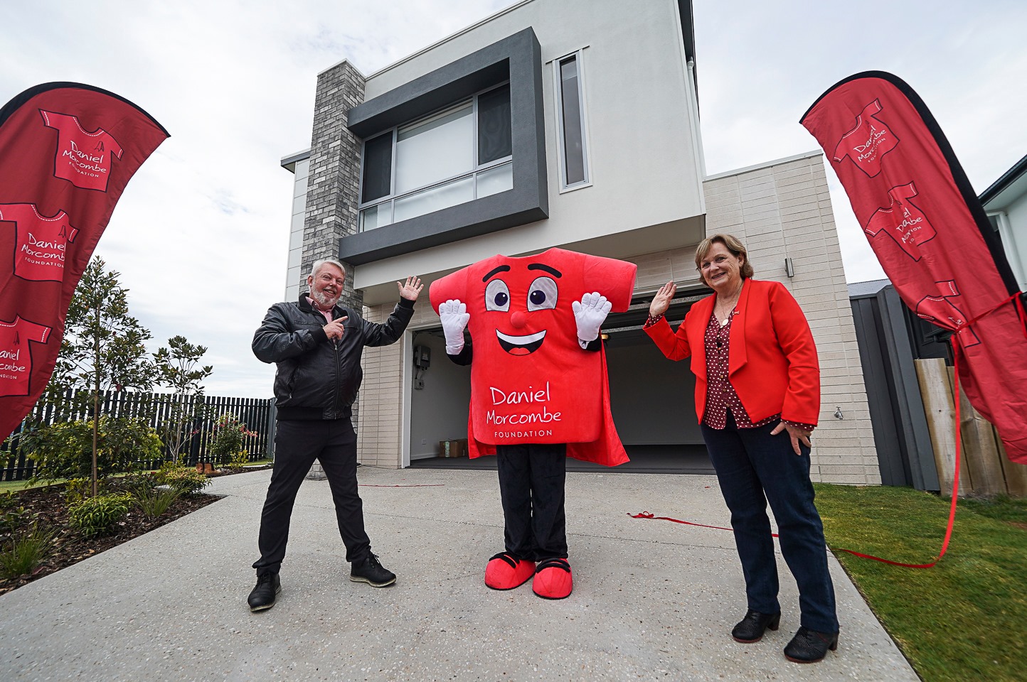
The result was brilliant. Light and easy to wear for any body shape and a happy new Morky, that will keep kids smiling and safe for years to come.
However, the journey did not end there. The Morcombes loved this Morky so much, we started talking about a custom made miniature plush version.
Previously the Foundation had done stock plush items with a nicely branded sweatshirt but doing a custom Morky was taking things to a new level.
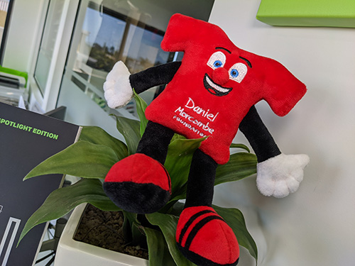
Working with the same drawings we went to work with our factory on an 18cm plush version.
The straight edges of the “Tee” shirt were complex, but the mini version started to come to life.
We added a 3D nose and embroidered features. The preproduction sample had an amazing response from the DMF team, and we know Morky will be hot property for the Foundations supporters.

At The Branding office, it is always about more than the brand for us. It is a labour of love. To know clients have trusted you and then you have delivered on that trust makes it even more satisfying!
What is your next project and can we help to literally bring your brand to life!